Showing posts with label typography. Show all posts

Monday, August 29, 2011

I LIKE BIRDS


Happy Peppy Poster

I like this cool and stylized typography made from ribbons, previously scanned. Created by I LIKE BIRDS, a graphic design studio located in the Speicherstadt in the port of Hamburg. I also like their crafted and experimental way. They experiment with various mediums to develop customized and interesting solutions. I LIKE BIRDS is focused on transforming numerous types of information into a visual language which conveys the content in a more fluid and effective manner. "We put a lot of time and effort into creating a wide range of print products, including posters, books, illustrations, corporate identities and other visual works for cultural and public purposes." See more;


Thursday, August 4, 2011

3X3 by Vivi Fitriani


3x3: MFA Thesis Exhibition by Vivi Fitriani, is an exploration of systems and rules set forth on mechanical lettering devices based on a 3x3 grid structure.

"Conventions and systems help convey meaning. Systems of communication are composed of structural mechanisms, which make order out of chaos. typography as a system, is stylistically influenced by the tools and process used to make it. These works explore a collaborative effort between predetermined design systems and the executor of those systems. In this body of work, i am investigating the effects of machines on written language and the exploration of mechanical connections to typography." - Vivi Fitriani. See more;

Walk/mark illustrates the exchange of movement between the participant and the reciprocating mechanical connections into an alterable letter. every point on the grid becomes part of a mutable letterform. It has an inbuilt predetermined system, which invites collaboration between the audience and the three by three grids lying on the floor. when the audience steps on a point of the grid, the input will produce markings on the wall installation, resulting in a letter.


Letto (below) is a lettering tool which responds to a 3x3 grid of lights. Lights are choreographed to form each individual letter from the alphabet. The longer the lights are left on for letto to follow these steps, the bolder the letter becomes.


"The investigation of the 3x3 grid and connected devices discovered limitations that challenge the structure of a letterform. this is developed as a thesis project to explore how predetermined systems affect the structure of communication and generative design."

Tuesday, May 10, 2011

Type At the Opera


Peter Biľak, set designer of Göteborg Opera’s upcoming dance production Eroica (see below), created a dramatic structure of metal pipes illuminated by individually controlled LED strips. The construction, which is an integral part of the performance, is eight meters wide, four meters high and four meters deep. All wires and electronics are hidden inside the pipes or under the floor, and the pipes themselves are so thin that they disappear into the darkness when not lit up. See more;

During breaks in rehearsals Peter used the structure to construct letterforms; the result is this simple video.


Eroica

In his longest work to date, choreographer Lukáš Timulak explores Beethoven’s landmark Symphony No. 3 “Eroica”. Inspired by the composer’s personal life, especially his Heiligenstadt period, Timulak looks into the life of an enigmantic man.

Timulak and set designer Peter Biľak also explore the notion of non-linear dance. While non-linear narrative is quite common in film, literature or even theatre, dance typically presents events in chronological succession. Timulak and Biľak introduce production elements that help to clarify that the opening of the piece presents the conclusion, while the subsequent material presents the events leading up to it. - Project by Thypotheque


Structure


Recommended see their new Dance Writer App for iPhone and iPad.

Monday, March 7, 2011

Pixel Painting


Pixel Painting is a typographic project created by Cameron Zotter and Jinhwan Kim. This work is inspired by Dentsu London's iPad Light Painting. Zotter and Kim experimented with motion and typography. Moving an iPod Touch in six rows, making a motion series of videos displaying sections of Akzidenz Grotesk type. They took a long exposure photograph of each session, capturing an interesting image of each letter. See more;

Download font (.otf, 29KB)

Download the 26 video files (.zip, 3.9MB) to get your own Pixel Painting type.


Wednesday, February 16, 2011

114.psd Type


114.psd Type is a simple typography which I designed once again thanks to Mac OS X, maybe it reminds to Folder Type, also created with Mac OS X.
The idea for this type came in when seeing that this operative system memorizes the position of any file or window when you minimize and maximize it. So I created 114 photoshop files (I only used six colors, I played with all possibilites in RGB with the numbers 0 and 255, excepted 0, 0, 0 and 255, 255, 255). Then I placed and ordered the files in the right position before minimizing them on the dock. And finally I captured the screen maximizing every file.
The video has been made with the collaboration of my good friend Dylan Fisher who has designed the sound for it.
You also can see the HD video on vimeo, hope you like it. - Emilio. See more;


Saturday, February 5, 2011

Heterosis by Brian Banton


Heterosis, kinetic typeface designed by Brian Banton, the typography was constructed from transparent acrylic and transparent elastic. All the characters were photographed 60 times at intervals of 6 degrees of rotation in order to produce the motion loop for the video. See video;

Each character in this kinetic typeface was designed by 'blending' two (essentially 1 dimensional) vector lines across a spatial plane in order to produce a 3 dimensional letter.

Thursday, July 22, 2010

Fred Eerdekens


Entrando en el espacio artístico de Fred Eerdekens vemos que el elemento fundamental es la luz, junto con los objetos y formas moldeadas y agrupadas formando diferentes formas abstractas que esconden algún mensaje. La tipografía está presente en la mayoria de sus obras, ver más dentro del post;


Monday, June 21, 2010

Fabian Seiz


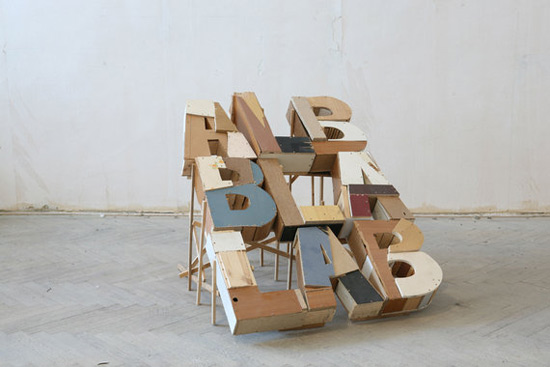
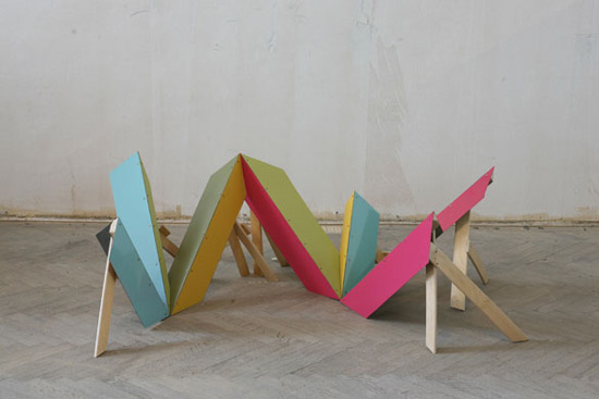
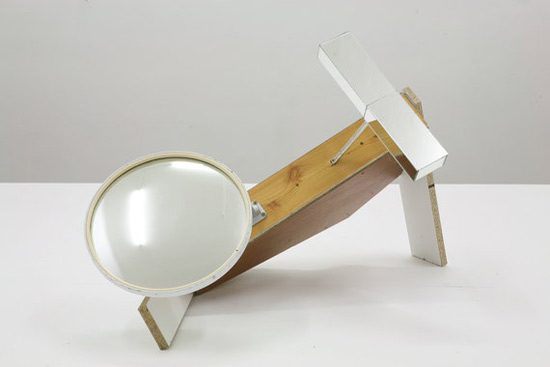
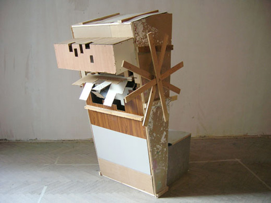
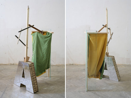
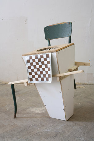
Fabian Seiz es un artista austríaco con sede en Viena que crea esculturas con objetos encontrados y con materiales no deseados. Muchas de sus esculturas adquieren forma de maquina como característica con un enfoque muy artesanal y reciclado. Fabian está representado por Layr Wuestenhagen en Viena. Ver más dentro del post;


Monday, May 24, 2010

Sam Winston


Sam Winston explora el lenguaje creaando esculturas, dibujos y libros que cuestionan nuestra comprensión de las palabras. Muy interesante ver como juega y compone las letras, de algún modo les da vida y ciertas propiedades que no estamos acostumbrados a ver en ellas. Ha expuesto su trabajo en museos del Reino Unido y los EE.UU. como; MoMA New York, Getty Research Institute, Los Angeles, the Tate Galleries London, and Victoria & Albert Museum. Ver más dentro del post;


[via]

Tuesday, April 6, 2010

Boy in Static - Toy Baby Grand


Vídeo musical realizado con TextEdit, incorporando gifs animados. Dirigido por Alexander Chen y Philip Stockton para Present Company.
Como me gustan estas cosas! Las que están hechas con programas o metodos a los cuales se les da otra función que no es la predeterminada, como en este caso hacer un videoclip y animar con el TextEdit. Me gusta el resultado que han obtenido, la dirección de arte y la canción, todo! También han creado una aplicación donde se puede jugar a la vez que transcurre el videoclip, se puede ver aquí.